A little over a year ago, Mobilegeddon hit the internet. Google's mobile-focused update was billed as one of the biggest changes to the search engine in years, and the enhanced focus on mobile-friendly and responsive eCommerce sites has certainly had an impact. Although the focus of the update was entirely on smartphones and mobile devices, it has had a knock-on effect which has caused websites all over the world to offer their customers a much better experience.
Responsive websites are now an essential component of any website. If your website isn't designed responsively, then are alienating a huge percentage of your audience . Just as bad, you could even be throwing away your search engine results page (SERP) position. Google is definitely going to provide higher rankings to adaptive websites which offer an enjoyable and comfortable experience for any user.
How Has Google's Mobilegeddon Affected The Internet?
For starters, the extensive coverage of Mobilegeddon and the results since its introduction have worked to scare and encourage business and website owners to create responsive website designs. Even Google were a little late to the party when it comes to mobile searching, as it was as early as 2014 when thenumber of mobile users surpassed those on desktop devices. 40% of all users would press the back button and return to their search engine results page if the site they chose was not responsive to their device and as many as 4 in 5 smartphone users would access retail content using their mobile device.
That was the internet landscape when Google introduced Mobilegeddon, on April 21st 2015. Today, responsive websites are absolutely essential if you hope to appeal to Googly, Yahoo or Bing. They are even more important when it comes to providing a great user experience (UX), which is one of Google's major concerns.
Today, as much as 60% of the internet is accessed using mobile devices including smartphones and tablet PCs. If you aren't already offering an adaptive andresponsive website, then you need to get to work as quickly as you can. Research has shown that as many as 91% of small businesses don't have their website optimised for mobile – you can't afford to offer your customers a substandard service, just because they are using their mobile devices!
People Are Using Their Mobile Devices To Access The Internet More Than Ever!
http://www.smartinsights.com/?attachment_id=53811
As you can see from the link above, the amount of time that people are spending on their mobile devices has hugely increased over the past decade. More people are using their mobile devices to access social media sites like Twitter, Facebook and Pinterest than ever before and retail is playing a large part of this.
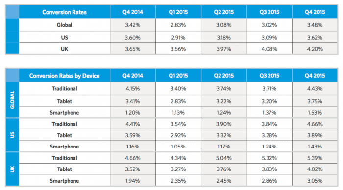
All over the world, people are using their favourite mobile devices to buy products, subscriptions and services. eCommerce is already hugely popular, but the conversion rates on mobile devices are quickly starting to increase. For many years, people have been hesitant to convert over mobile devices over security fears. As it becomes more and more convenient, and more websites are taking the time to reassure their customers, the conversion rate for mobile devices is quickly starting to rise.
The above Smart Insights table shows the average conversion rate by device in both the UK and the US. As you can see, the conversion rate for mobile devices drastically improved following on from Google's Mobilegeddon in both the UK and the US. It is unsurprising to see that the largest rise took place in the UK, which is the world leader in eCommerce .
Responsive eCommerce websites are absolutely essential if you hope to take full advantage of the benefits which online retail can provide. eCommerce is no longer a nice feature to offer; your business will not be able to survive or continue to grow, if you aren't offering your customers the ability to buy directly from you.
How Can You Develop The Perfect Responsive eCommerce Website?
Now that you understand just how essential a responsive website is to your business, you're wondering how you go about creating one. Well, here at Advansys, we can help you to develop the perfect online solution for your needs, with a focus on UX and brand identity. It really can help for you to understand the best practices when it comes to designing and developing your adaptive responsive website to make sure that it can appeal to Google, Yahoo and Bing, as well as your customers.
Here are 10 tips to help you get started with responsive website design:
1. Always Design For Mobile First – Before you start to plan out your bespoke design on a desktop or laptop screen, make sure that you think about the user experience on a mobile platform,like a smartphone or tablet PC. Not only is mobile now more relevant than desktop, it is also much harder to scale a design down than it is to scale it up.
Focus your website design on a mobile user and build outwards – you don't want to design a perfect layout, only to lose it all as the screen size gets much lower.
2. Understand What Mobile Actually Means For Your Users – People interact with websites in different ways, especially when using a smartphone. A lot of the time, people will want a quick and easy interaction on a mobile device whereas they might prefer something a little more detailed and visually-pleasing on a desktop or laptop screen.
Still, you can continue to adapt your website once it has been built. Once you understand which features your customers are using on their mobile devices, work to make them larger and more accessible on the design. The search bar is a good example – if your customers prefer to search for information rather than attempt to use your navigation, make the search bar easier to click on and use.
3. Understand The Tech Behind Responsive Design – There are three main features of responsive website design which you need to understand. When used together, your website will be able to dynamically adapt to the requirements of the device it is being accessed on. These three features are:
- Media Queries – These are pieces of code which gather information from the browser and device. Once they've collected this information, they influence the website to change shape, size and layout to perfectly fit the chosen device.
- Flexible Media – This feature will enable any media element to scale up and down based on the size of the screen and the browser. This can work on a full range media types, including images, videos and text. In some instances, the written content itself will be swapped out in favour of a simplified, cut-down version.
- Fluid Grids – This is a percentage-based system which allows the website design to move and change position based on the information supplied by the media queries. The differences that this technology can make include the resizing of content and changing the general website's design from a horizontal design to a vertical one, making it more suitable for mobile devices like smartphones.
4. Think About The Need For Speed – One of the only drawbacks for responsive eCommerce websites is that they can often take longer to load when compared to non-responsive alternatives. Most will completely load in less than 8 seconds, but 64% of modern smartphone users expect a website to load in 4 seconds or less .
There are a couple of different reasons for the slightly slower load time. The biggest culprit is the presence on non-optimised images, which can take significantly longer to load and shrink down. Fortunately, using tools like Adaptive Images and TinyPNG, you can quickly scale down all kinds of hefty images.
Media queries can also contribute to the load time of a website, but this difference is measured in milliseconds and is always worth the extra load time to make sure the final website is of the highest quality.
5. The User Experience Is Everything – Although UX is always important in any kind of commercial website, for mobile-friendly and responsive websites you need to make it the most important thing. There are dozens of potential problems that you can run into which will completely ruin the experience for your users.
There are too many to list here, but just a few of the most common include:
- The Hamburger Menu – Known as the Hamburger, this feature is the three lines which indicate a hidden menu. They are a useful addition when it comes to offering a good navigation to your website without taking up too much space. However, if the user has to keep tapping it to move from page to page, or product to product, it can quickly become tiring.
A good way around this is to keep less popular links in the hidden menu but to make sure your popular links and content are available on every page. - Content Readability – One of the worst things businesses can do it make their content text too small or too large. This isn't just a mobile problem either, and there are thousands of websites out there which need to be resized in order to become fully readable.
Make sure that your text is large enough to read from a small screen, but isn't too large that it requires lots of scrolling to get through a single sentence. A test size of 16 pixels or 12pt is usually acceptable. - The Right Button Size – On mobile devices and websites, space is an absolute premium. It can be tempting to make button sizes small in order to fit more content on the immediate space. However, a small button will quickly become frustrating and could cost you more than a few conversions and sales.
You should make sure that your buttons are at least 44 x 44 pixels. Padding is a good way of increasing the acceptable tapping space without cutting too far into your available website space.
6. Always Design For Screen Orientation – People will turn their devices in order to create the best interaction for them. You need to make sure that your website can be used on a horizontal or vertical basis (as per fluid grids). What's more, you need to make sure that the interaction remains just as high-quality and that none of your text or images are forced to stretch.
So long as you follow all of these tips, and keep your user experience in mind throughout the entire design process, you'll be able to take full advantage of the benefits provided by responsive eCommerce.
Get In Touch With Advansys For Bespoke Responsive eCommerce Website Design
At Advansys, we can create a full range of unique responsive and adaptive websites to make sure that your business can offer a great UX on every device. Ifyou want to improve clicks, conversions and sales for your business online, then you need to take advantage of the highest-quality responsive eCommerce solutions today.
With Google now paying special attention to those sites which are suitable for both mobile and desktop use, responsive website design is now essential for search engine optimisation as well as online retail.If you want to attract customers to your site through search engines, and make sure that that they have a great experience whilst they are there, bespoke and responsive eCommerce is absolutely essential.
For more information on the benefits of adaptive web design and development, get in touch with our team today on 0845 838 2700. Alternatively, you can email any questions or concerns to sales@advansys.com and we'll get back in touch as soon as we can!
We’re always happy to help and can help you take your business in the right direction.
You are always welcome to visit us in our Wokingham office or you can also call us on 0118 380 0201 and drop us a message via our the website.
We'd love to show you how you can get more web traffic and leads, increase your online sales, provide better customer service & grow online.
Find us
4 Millars Brook
Molly Millars Lane
Wokingham, Berkshire
RG41 2AD, UK
